
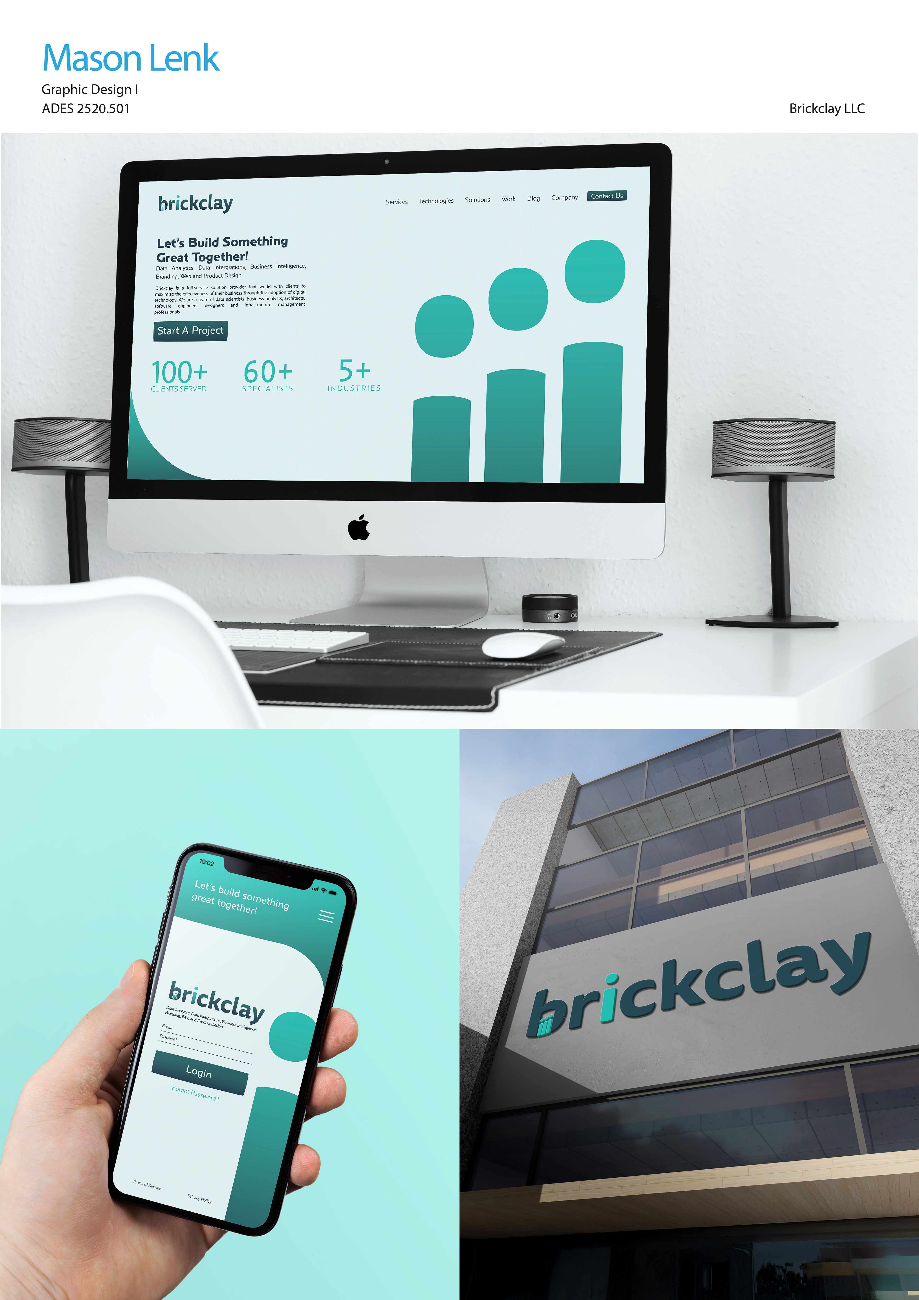
For this project, I had to apply my wordmark to various products, including a website, an app, and architectural signage. I wanted my products to still show my wordmark's friendly and professional tone. To do so, I continued using teal and blue to represent growth and reliability, two core tenets of Brickclay LLC. Overall, I think I was able to convey a professional yet friendly tone, something that will help Brickclay attract other businesses as partners.
Final brandboard and mockups created for Brickclay LLC, made using Illustrator, InDesign, and Photoshop, turned in to Professor Kyleene Finley.