
When I heard we were doing a menu project, my mind automatically began to float towards the idea of making something that could specifically be enjoyed by children. Once I was assigned an ice cream shop named 'Sprinkle's' I knew I had received exactly what I wanted. My main struggle with this project was finding a way to make a menu that could be enjoyed by kids while remaining designed effectively. I wanted the back of my menu to revolve around a mascot named Sprinkle The Ice Cream Clown that could be enjoyed by children. The page containing the menu contents would be designed more professionally while still containing elements that make the menu feel young and playful.
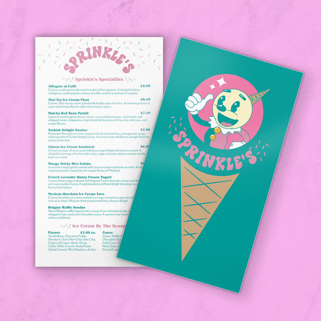
(Above) Final mockup created for review.
(Below) Final designs created in Adobe Illustrator and Adobe InDesign and turned in to Professor Whitney Holden for grading.
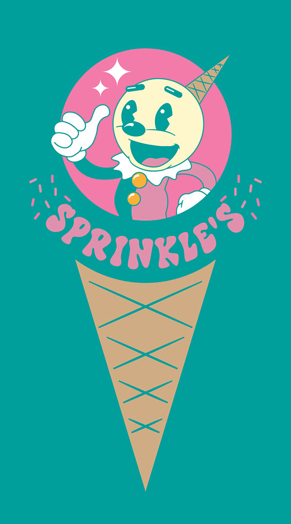
Final image of back of menu created using InDesign and Illustrator and submitted to Professor Whitney Holden for grading.

Final image of front of menu created using InDesign and Illustrator and submitted to Professor Whitney Holden for grading.
After completing my sophomore year in the Communication Design program, I revisited this project to address some of the concerns raised from the portfolio review and the classwork archive review.
After both reviews, it was brought to my attention that I tend to rely on the color teal, as well as centered designs, both of which are featured in this design. On top of that, I found that the color palette lacked value contrast, and the type pairing I used for the menu items didn't fit the theme of my design. I also found the illustration style of the cone, sprinkles, and mascot didn't feel consistent. I addressed the issues in a tweaked design with a refined color palette, typeface pairing, and illustration style, as well as an asymmetrical section towards the bottom of the page. I also added more texture to lean into the retro aesthetic of the mascot and the display typeface I used.

(Above) Revised mockup, created to track my own growth as a designer. Not submitted for any grading.
(Below) Revised designs, created to track my own growth as a designer. Not submitted for any grading.

Revised menu, created to track my own growth as a designer. Not submitted for any grading
