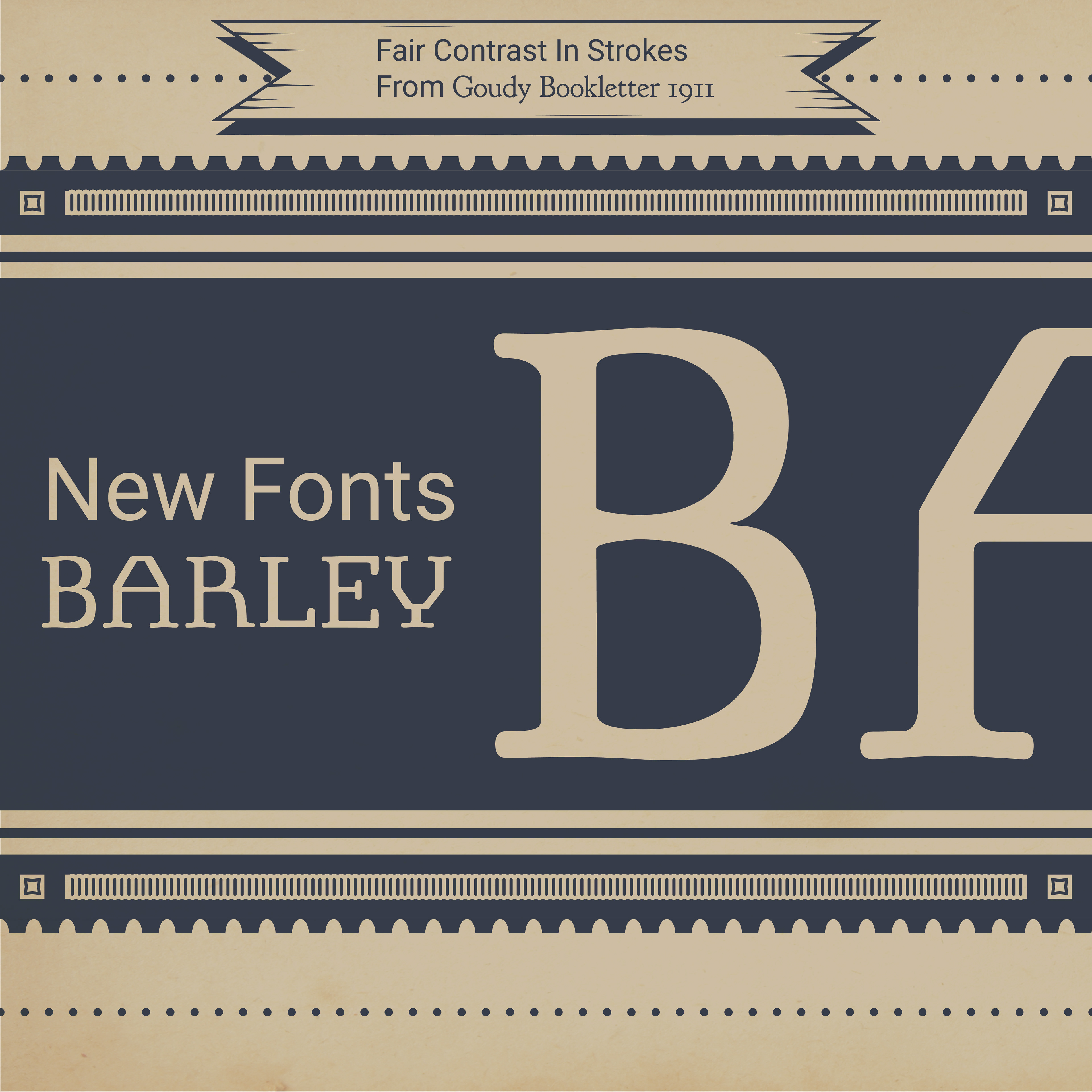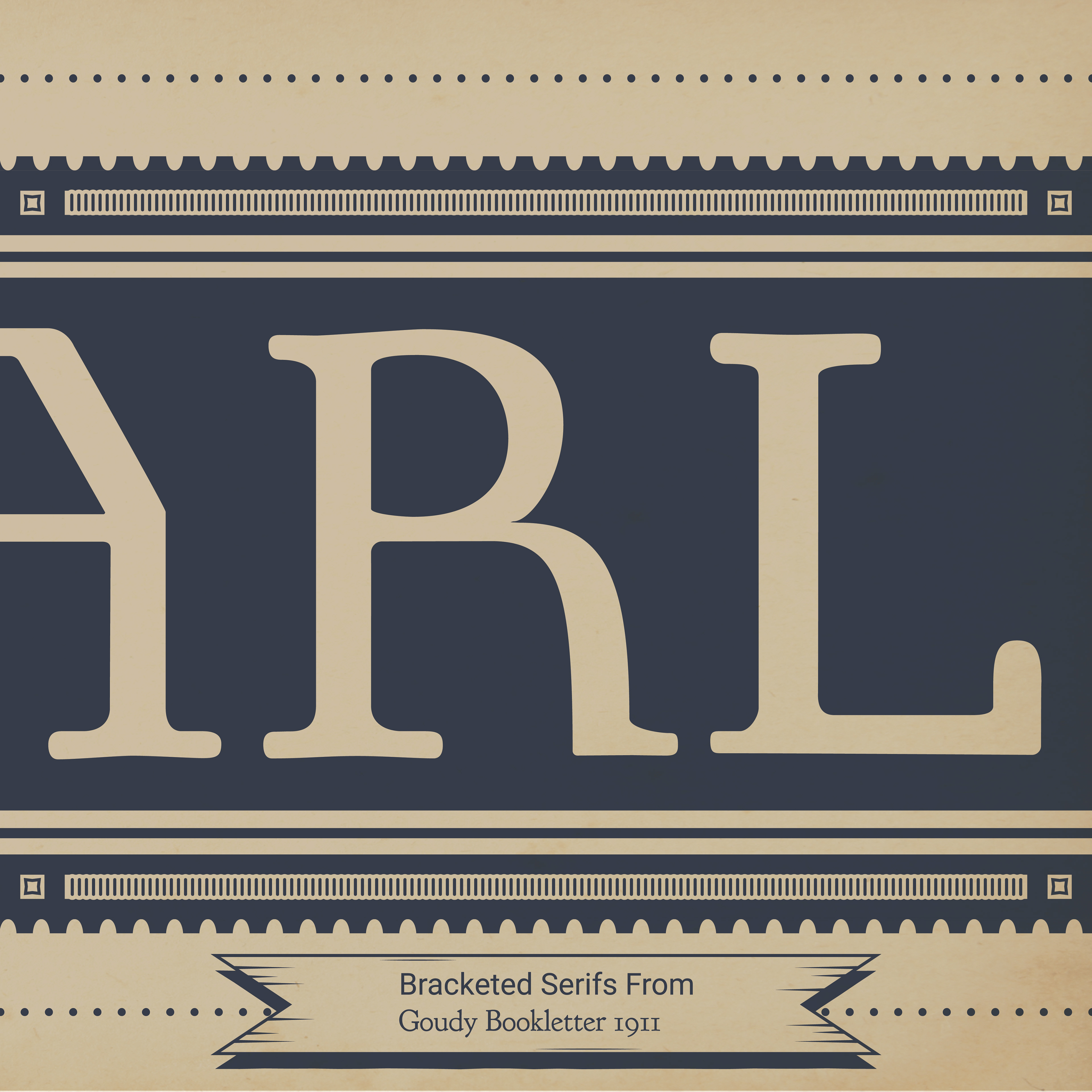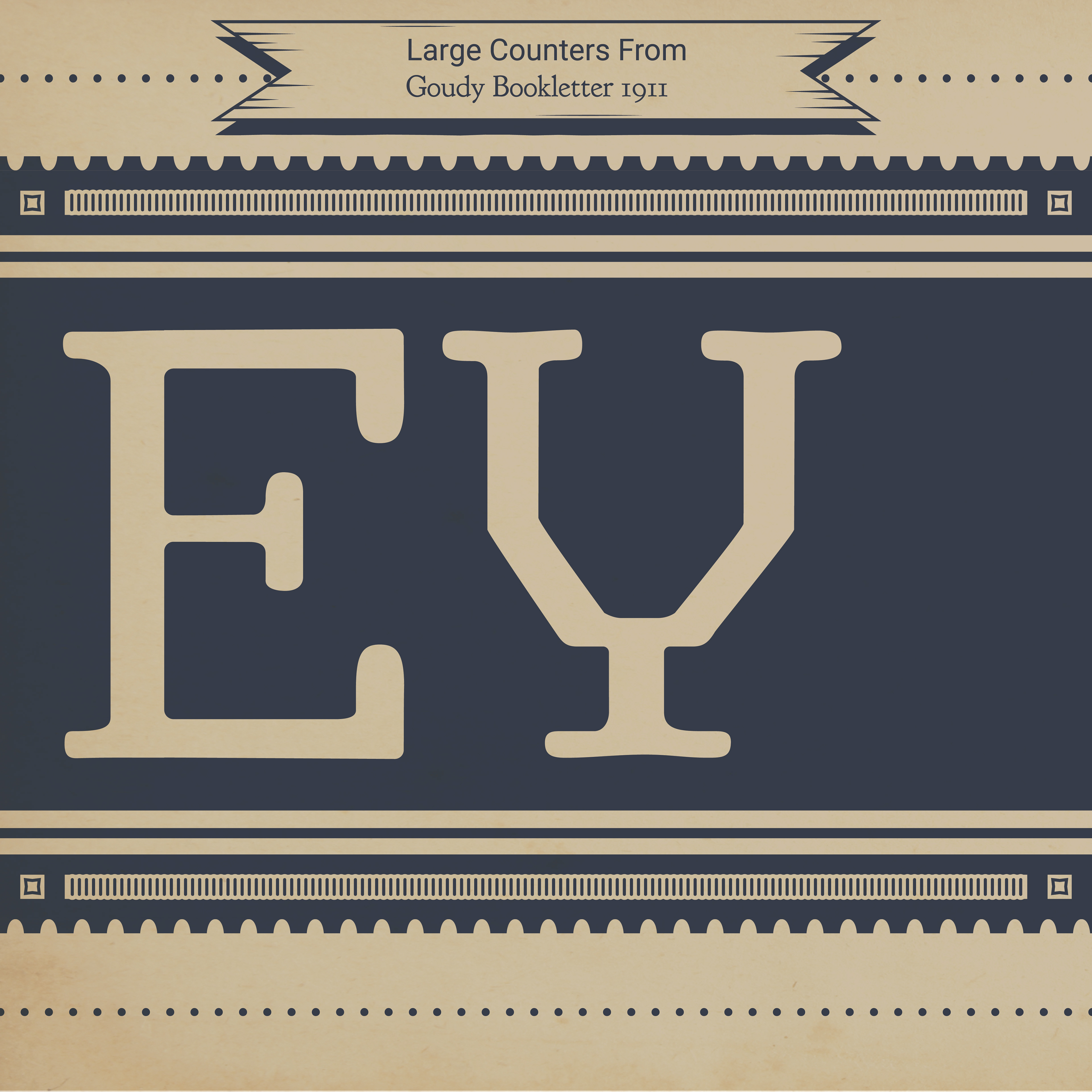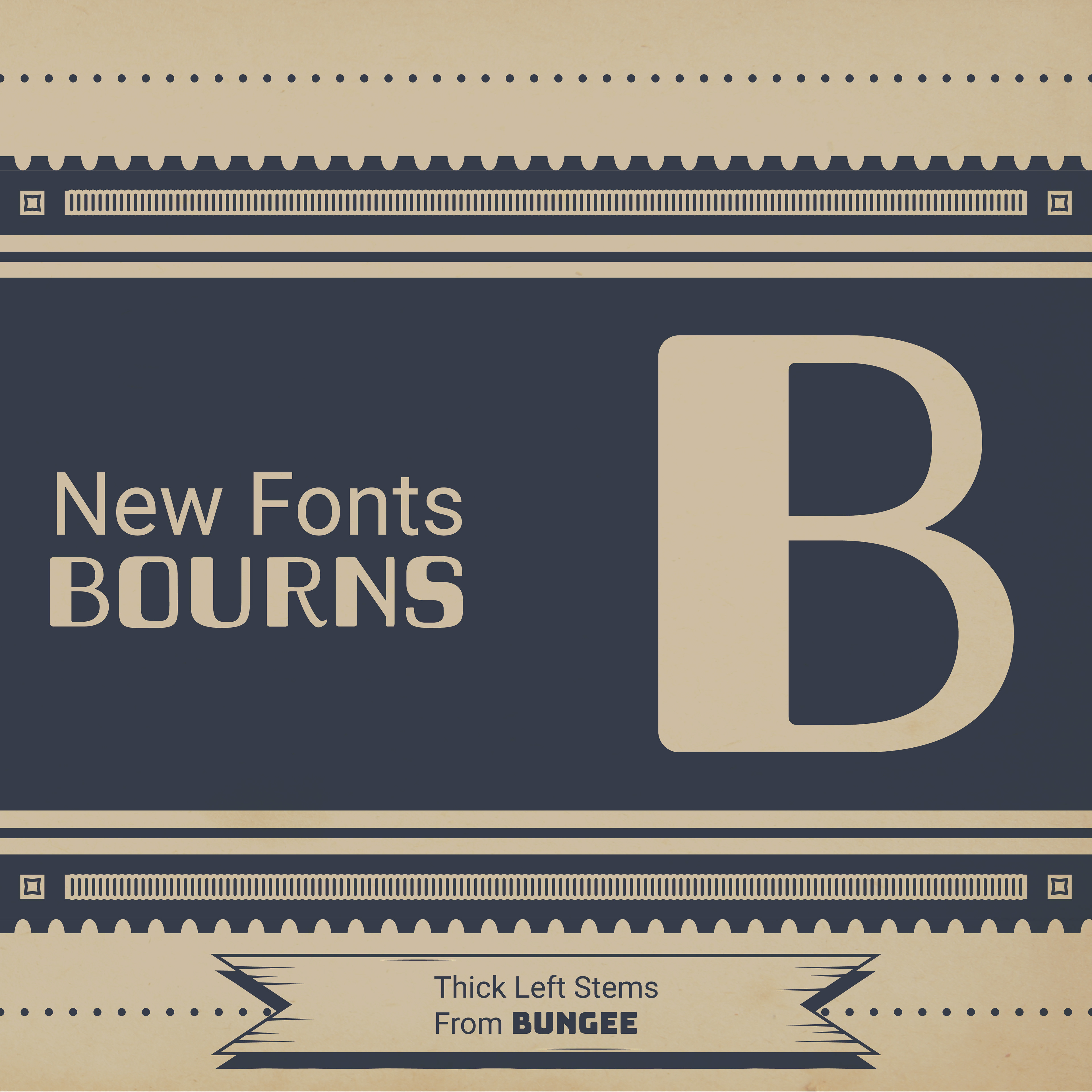
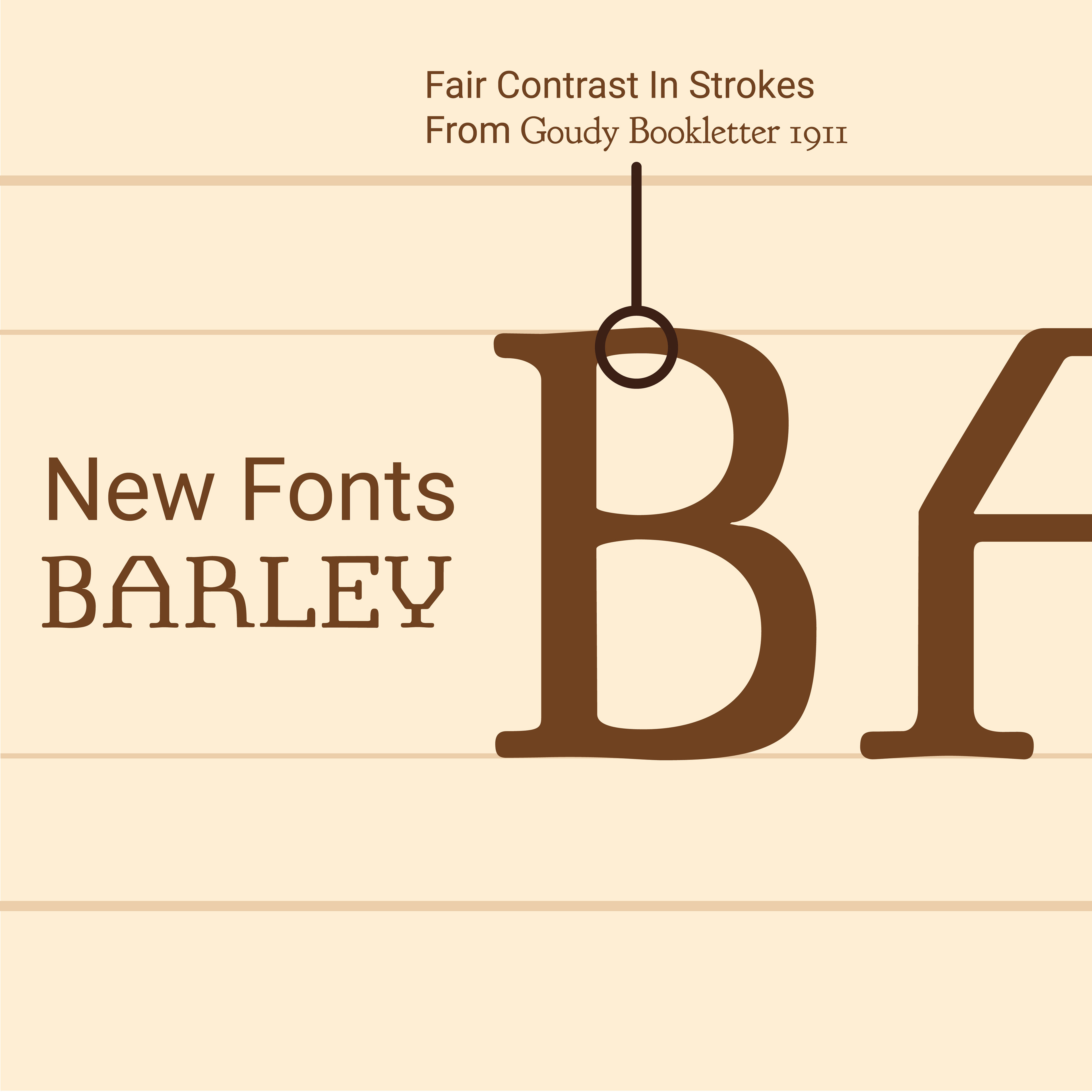
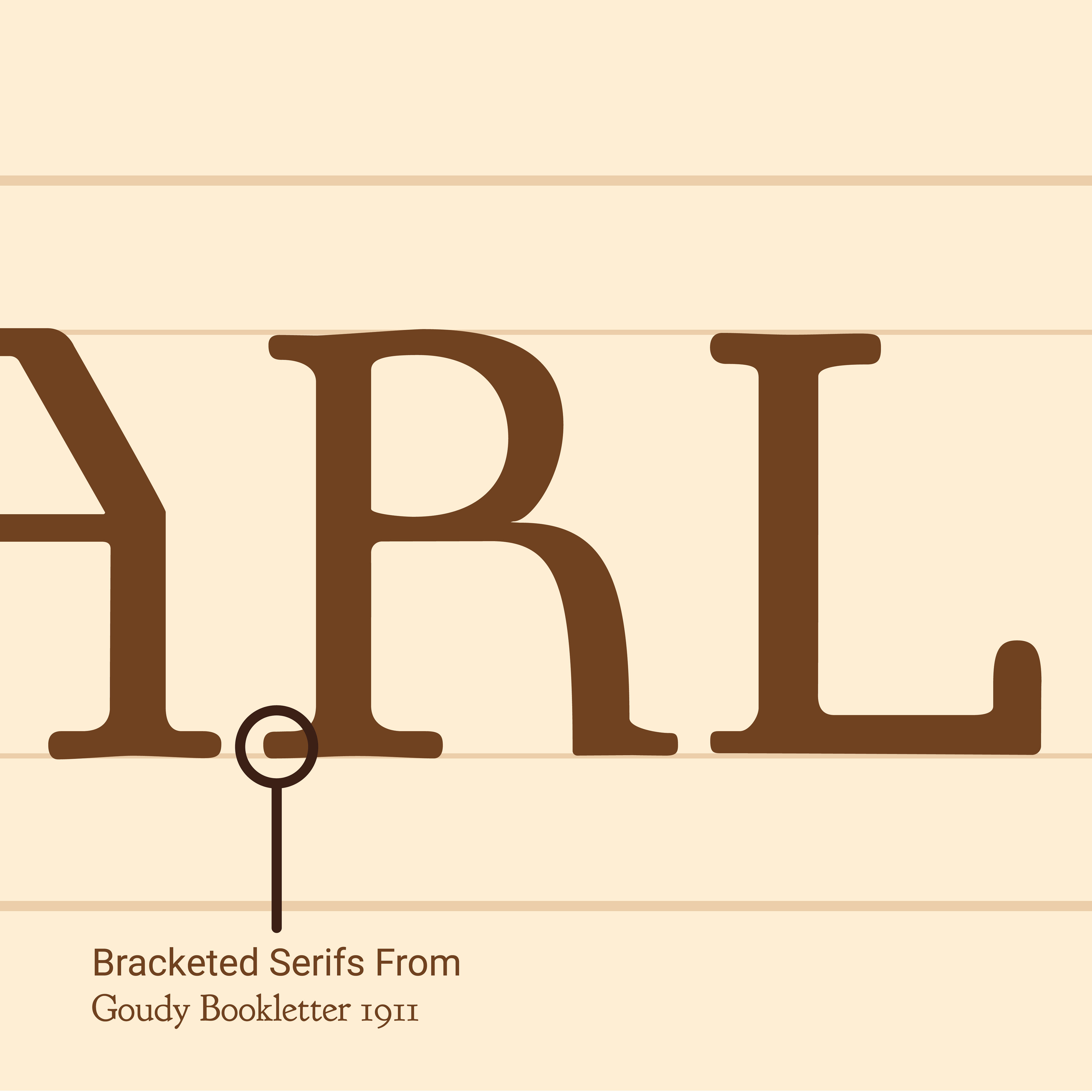
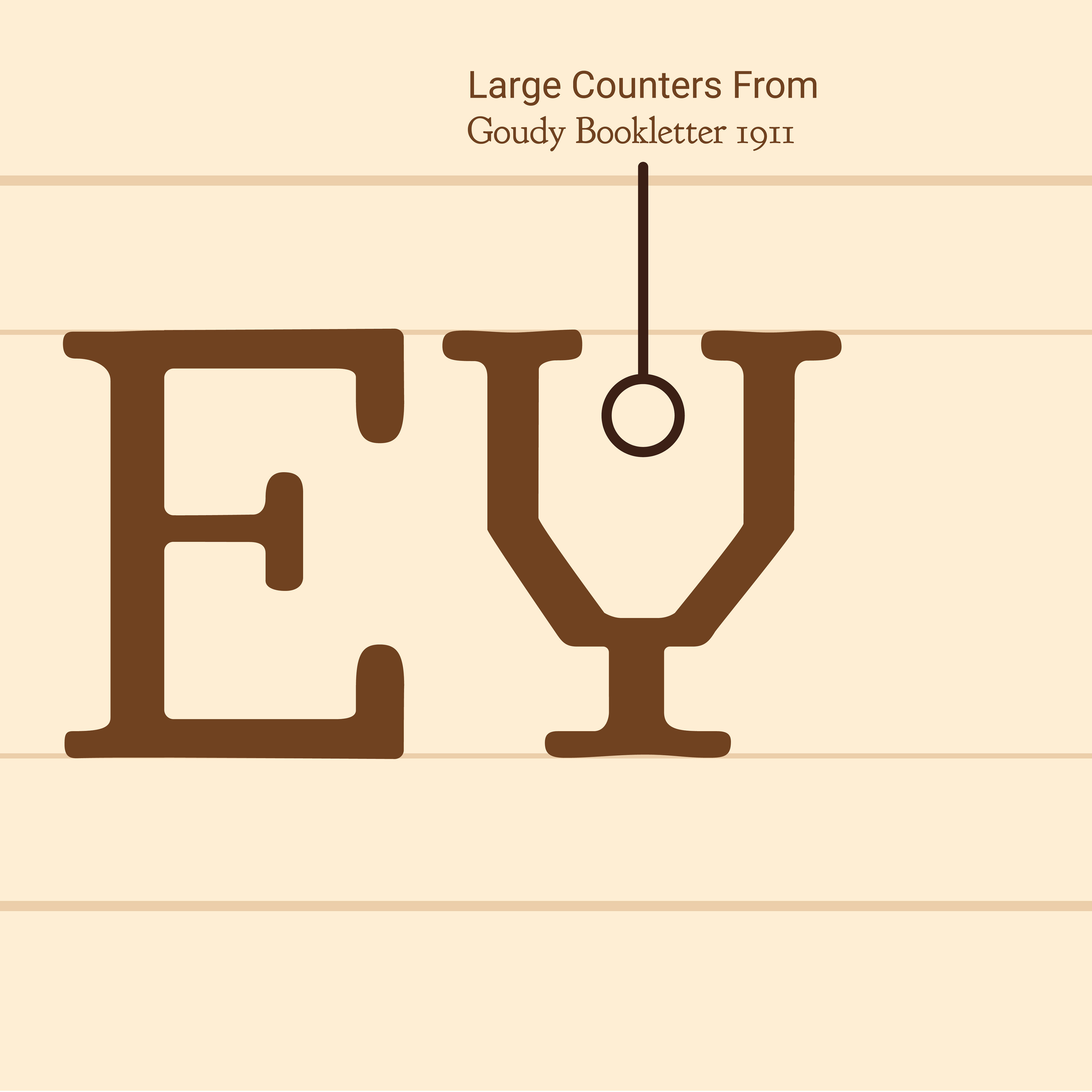
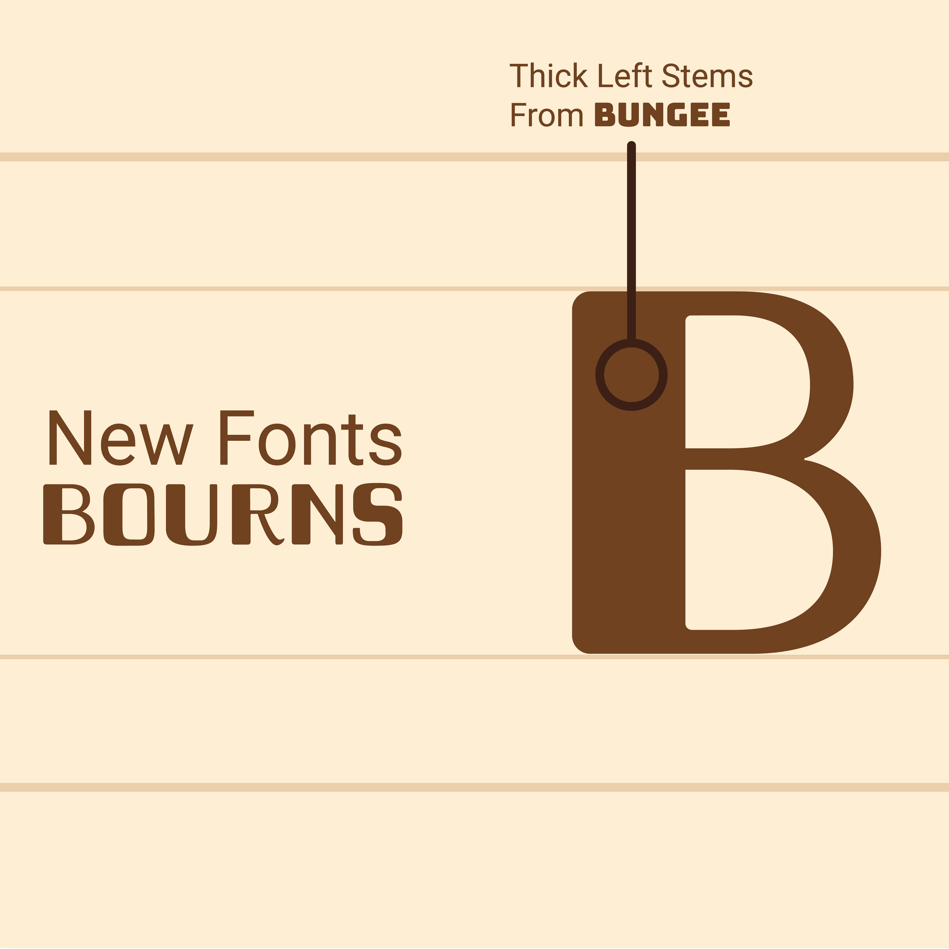
For this project, I had to create two new typefaces based on the source fonts Goudy Bookletter 1911 and Bungee. Each of the two typefaces I created had to be a 70-30 mix between the two sources leaning in either direction. While preparing for the design process, I started with the step my monogram project ended in, defining a brand. After researching both of the source typefaces and conducting polls to see how non-designers interpret them, I thought a brand that would fit a combination of my sources was an artisan whiskey company, something that mixes the fun of Bungee with the maturity of Goudy Bookletter 1911. When my designs of the letterforms were complete, I used my brand identity, along with my knowledge of typography to create type specimens in the form of Instagram carousels to advertise my new typefaces.

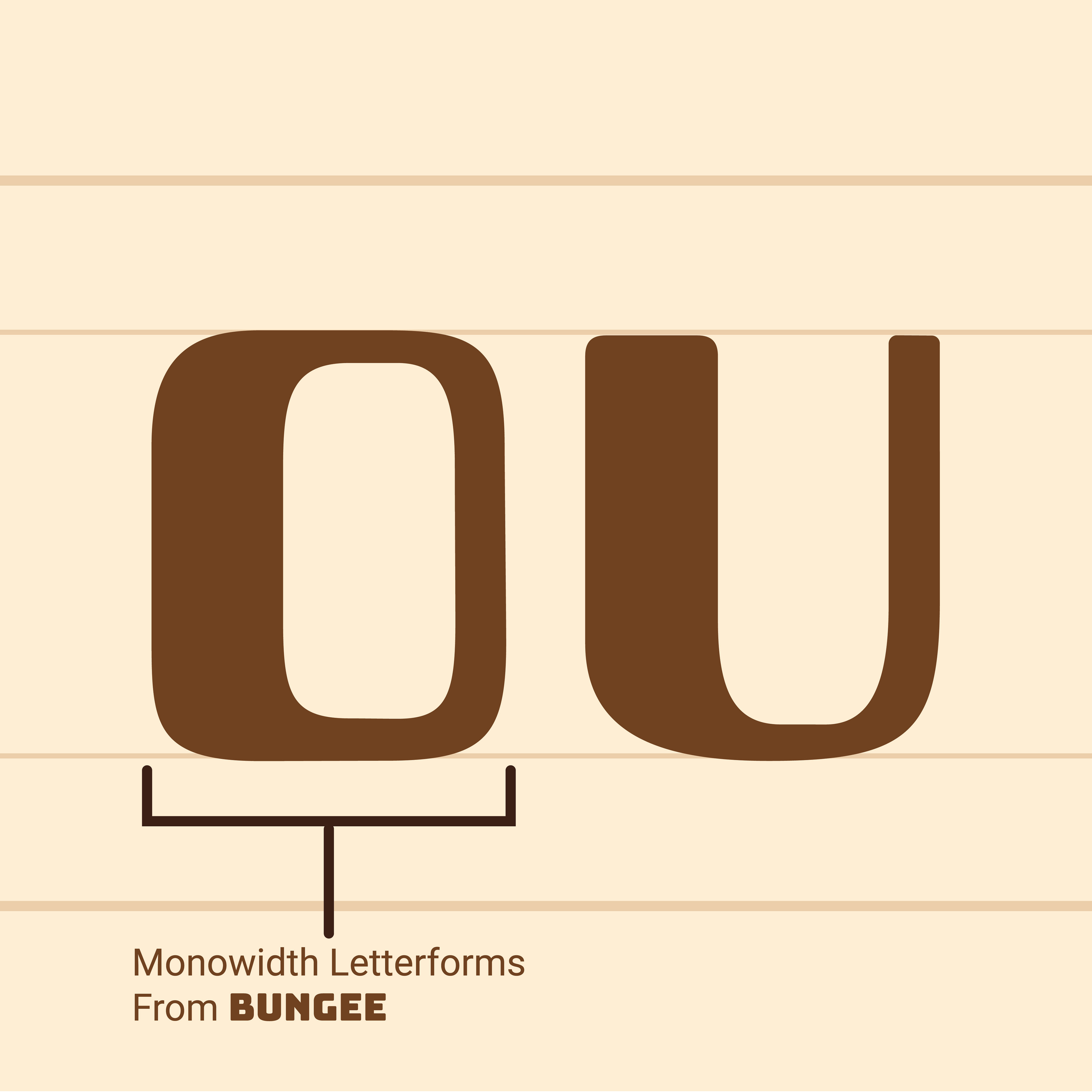
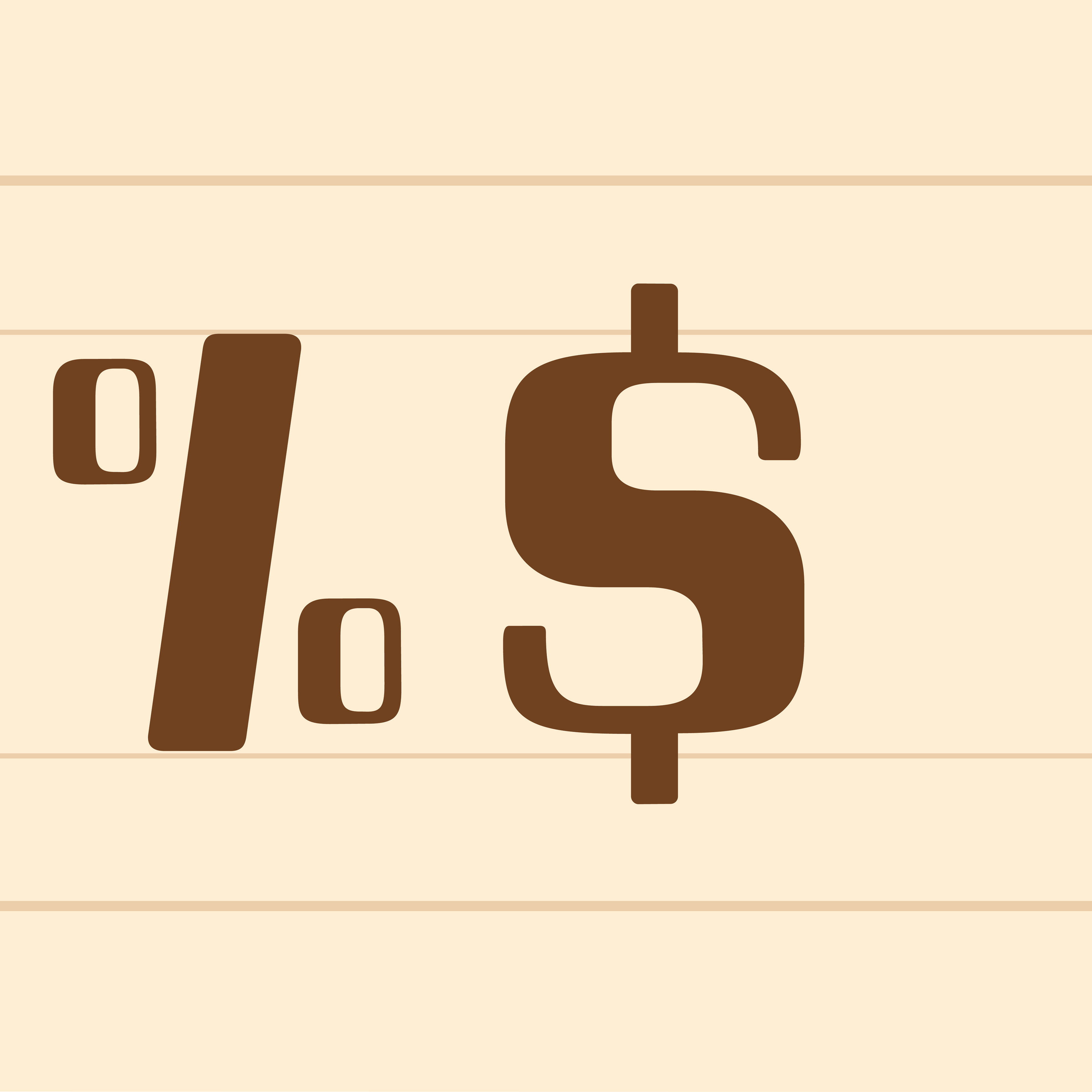
(Above) Final showcase of both original typefaces featured with the source typefaces they were based on, and turned in to Professor David Wolske. Original letterforms were created in Adobe Illustrator, and the final showcase was arranged in InDesign.
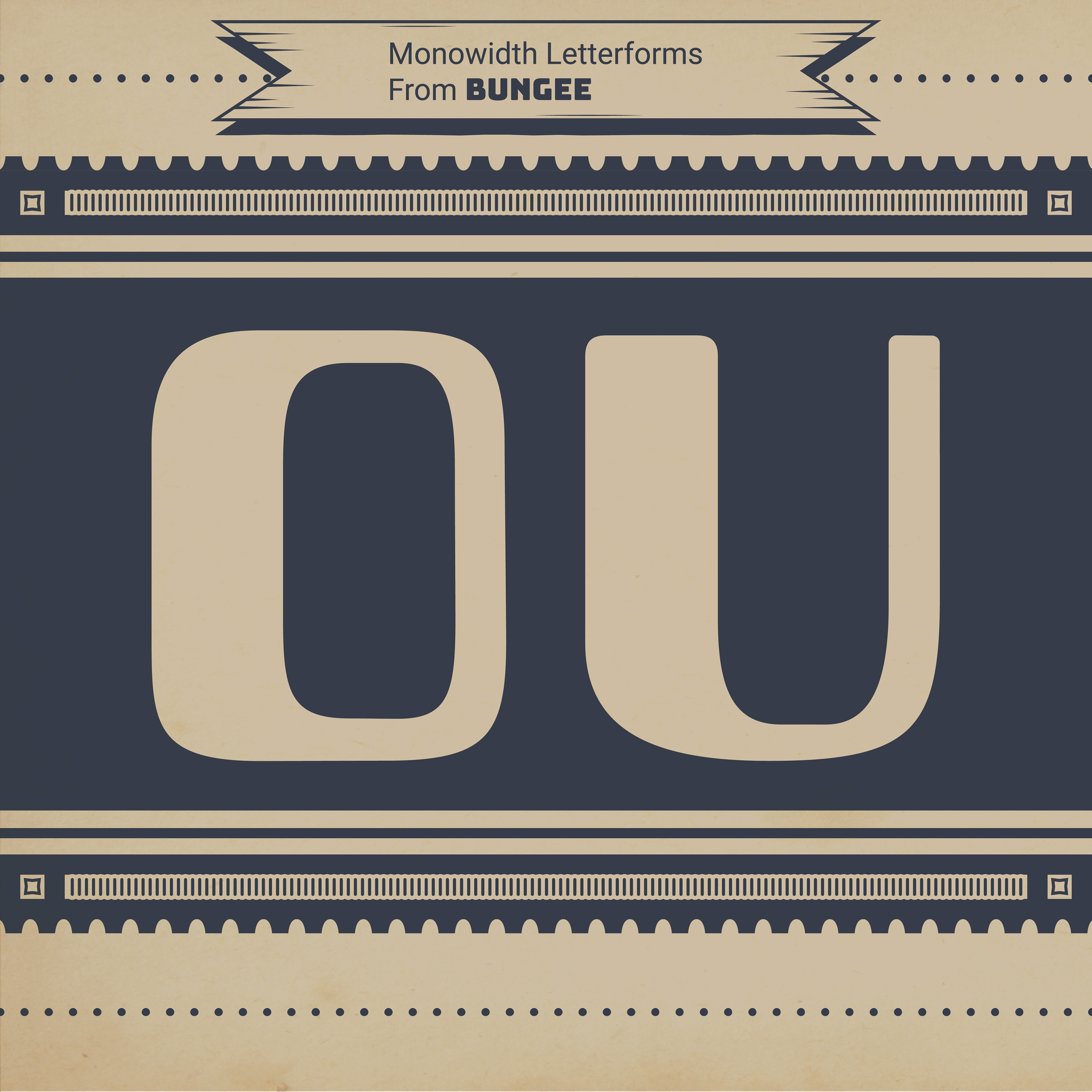
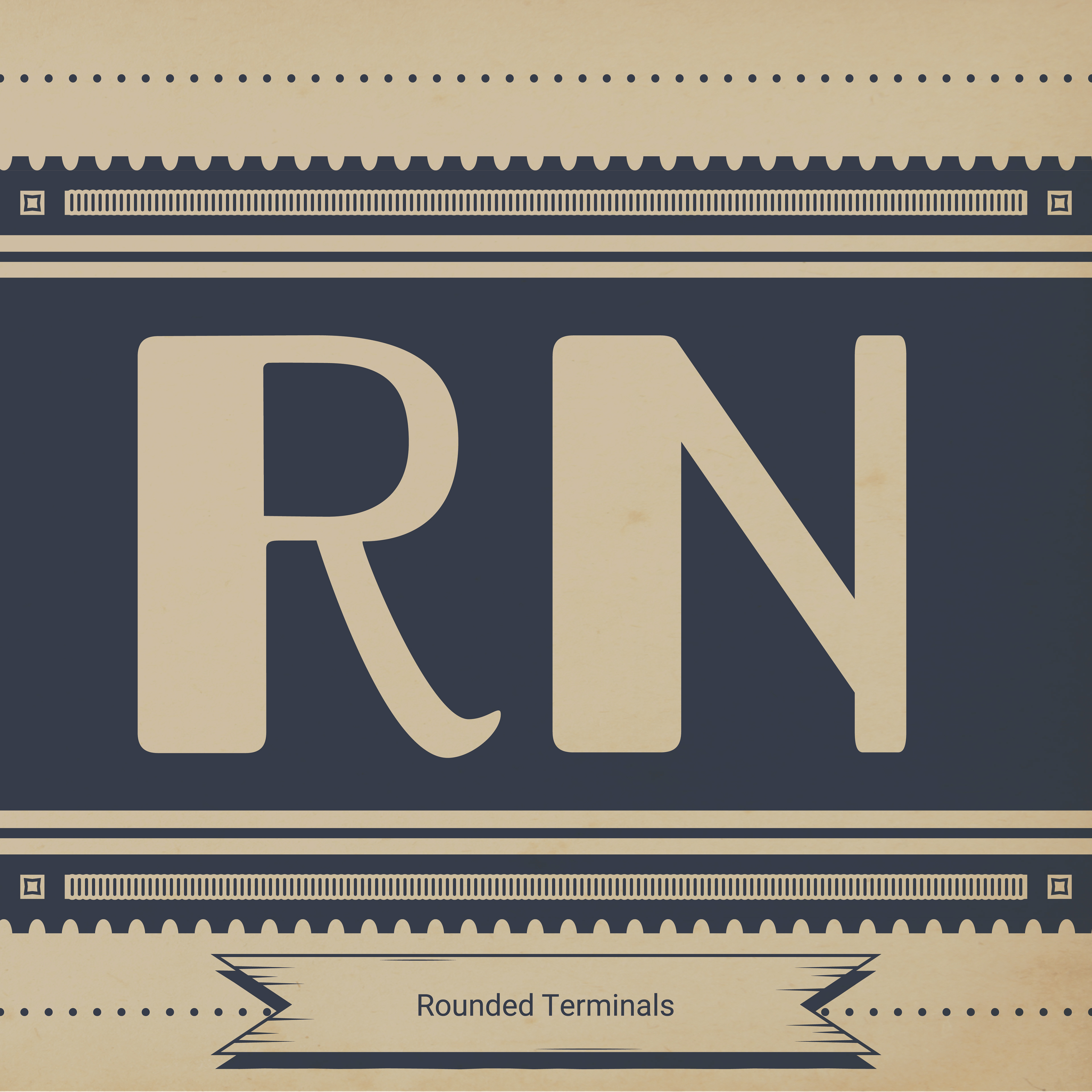
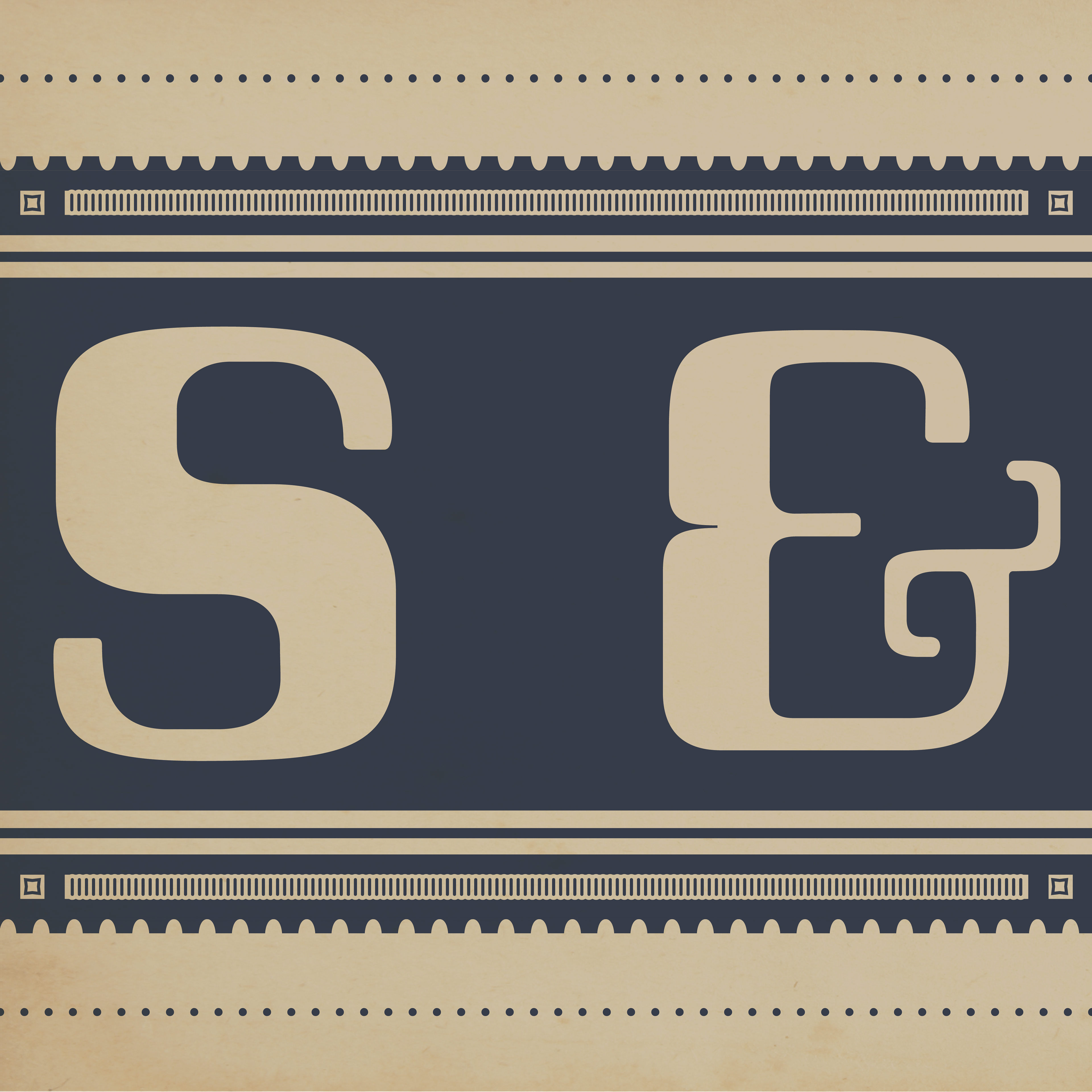
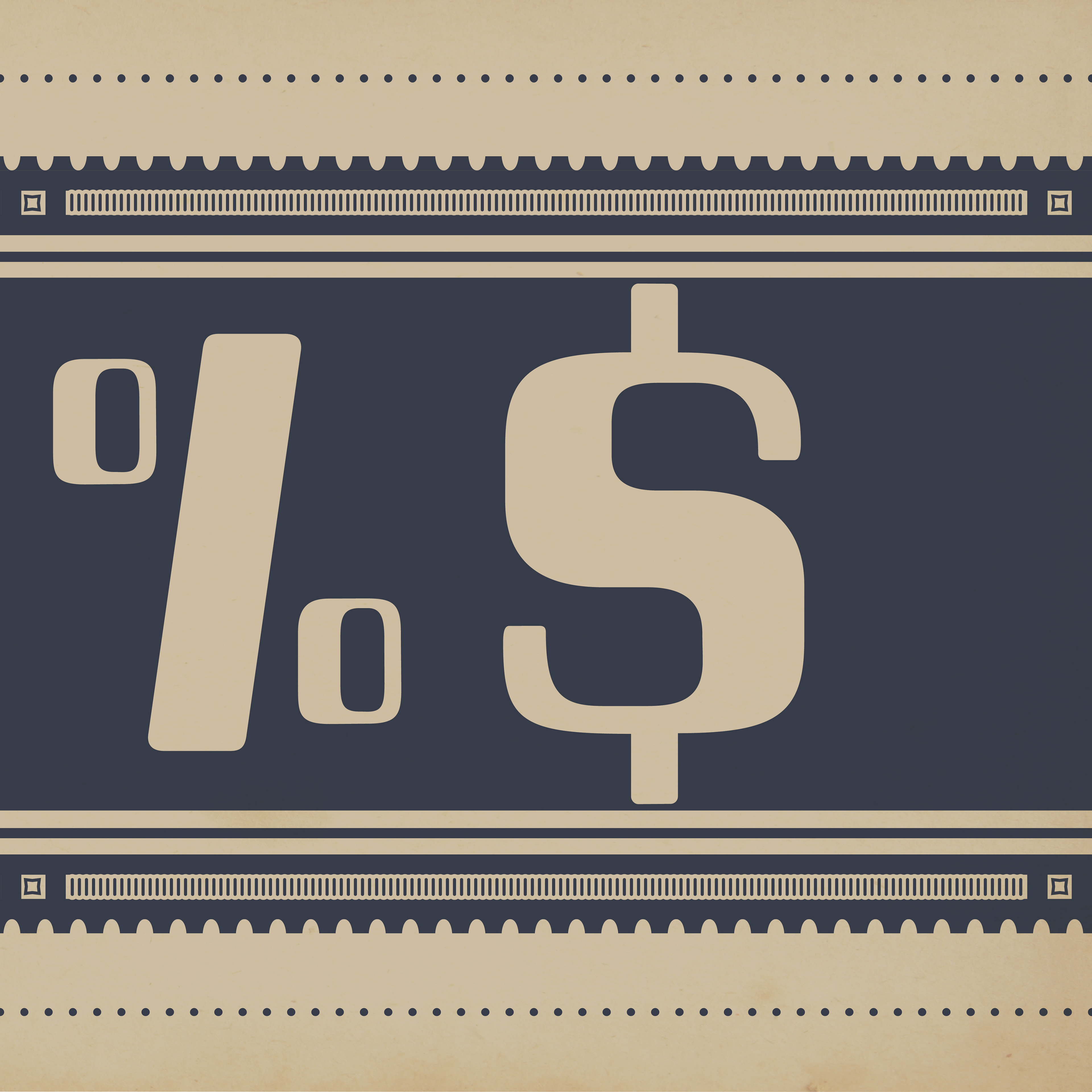
(Below) Final Instagram carousel created in Adobe Illustrator and turned into Professor David Wolske for grading.


After completing my sophomore year in the Communication Design program, I revisited this project to address some of the concerns raised by Professor David Wolske after it was initially submitted.
For the most part, my typefaces were well-made and were able to effectively communicate the keywords I laid out for them, as well as sticking true to the typefaces that inspired them. However, the Instagram carousel was not able to convey the story or keywords I laid out for these type specimens. To address this, I went back to my carousel design in an attempt to make it look more similar to artisan whiskey labels and match the story I created for Barley and Bourns.